Premium section design
Long-form sections, large typography, clean composition, premium gradients, and polished content blocks built for productized agencies.
Home 2 is built as a high-end business homepage for agencies that need stronger visual hierarchy, richer section design, polished spacing, premium card styling, and flexible storytelling blocks. This version adds more content, more visual depth, and a much stronger overall UI/UX structure.
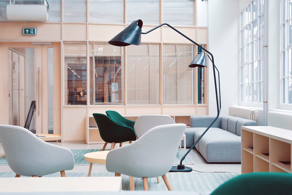
Every area in this homepage is designed to feel deliberate. It balances brand positioning, lead generation, service storytelling, proof sections, and conversion-oriented layout blocks.
Long-form sections, large typography, clean composition, premium gradients, and polished content blocks built for productized agencies.
The layout supports stronger storytelling for offers, positioning, process explanation, proof, and service pages without looking repetitive.
Light, dark, and warm themes plus multilingual UI control make the template more flexible for broader audiences and product delivery contexts.
We clarify the audience, offer, growth barrier, buyer intent, and message hierarchy before design begins.
We shape the page architecture, premium content blocks, CTA structure, and visual rhythm to improve perceived quality.
Once the template is implemented, we refine based on engagement, conversions, and stakeholder priorities.
These cards are structured to look premium while still giving enough room for long descriptions and positioning-rich copy.

We turn fragmented brand direction into a sharper acquisition narrative with clearer conversion paths across the site.

Every section is designed to feel composed, modern, and credible while keeping the reading experience effortless.

We use shared includes, cleaner structure, form handlers, admin utilities, and stronger responsive behavior.
These examples demonstrate how a richer template system can support case study framing, service proof, and brand authority.

The redesign aligned messaging, proof blocks, and product education into a cleaner journey.

A complete visual reset improved executive confidence and made the product easier to present.

Better hierarchy and section sequencing increased average engagement and clarity.
“The updated design feels substantially more premium. It looks structured, intentional, and trustworthy across desktop and mobile without the typical template feel.”
Sarah Nolan Director of Growth, PixelriseThe layout now uses larger spacing, stronger typography, local image assets, better card proportions, clearer interaction states, and more professional section variety. Desktop submenus only appear on hover and are no longer stuck open.
Use the contact page to start a project discussion, request customization, or adapt this template for your own client delivery workflow.